Role:
Design Director
Hand-On Design
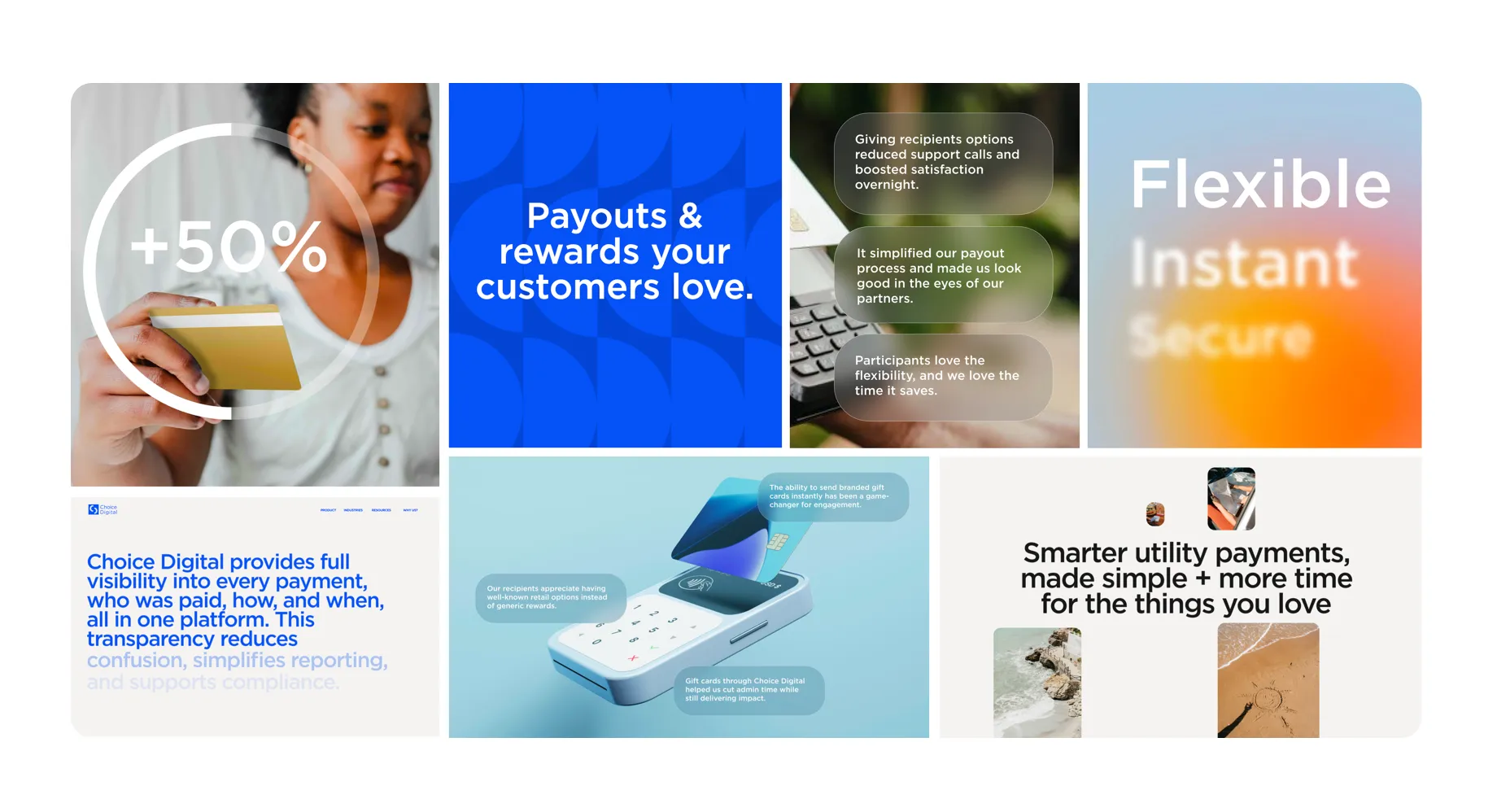
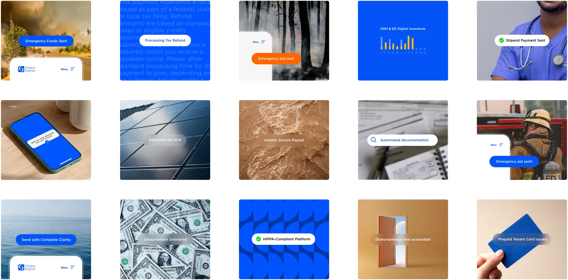
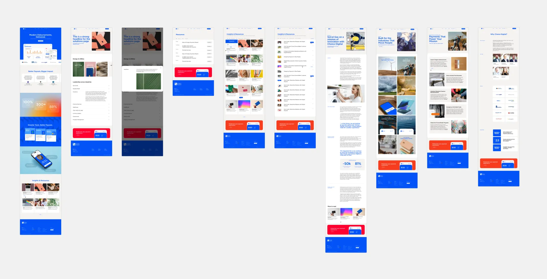
For this project, we partnered closely with the client to develop the site alongside the product prior to launch. Building from the existing logo and color palette, we expanded the brand voice and visual concept around the idea of “clarity” to make the payments and disbursements platform feel simple, approachable, and easy to use. Through abstracted UI elements, bright approachable colors, and transparent interface treatments with elements gradually coming into focus, the visual system reinforced the product’s emphasis on simplicity and ease of use.